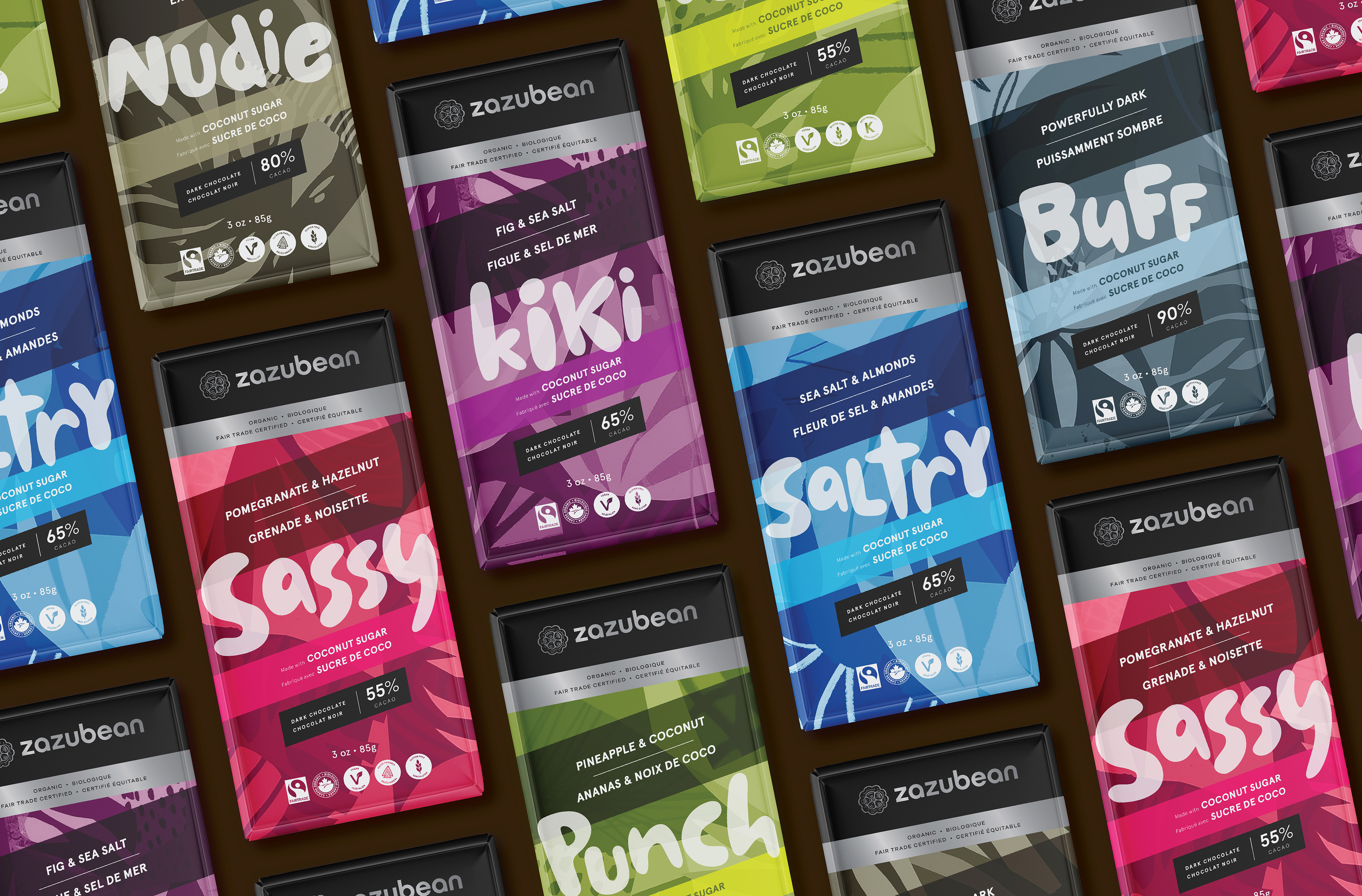
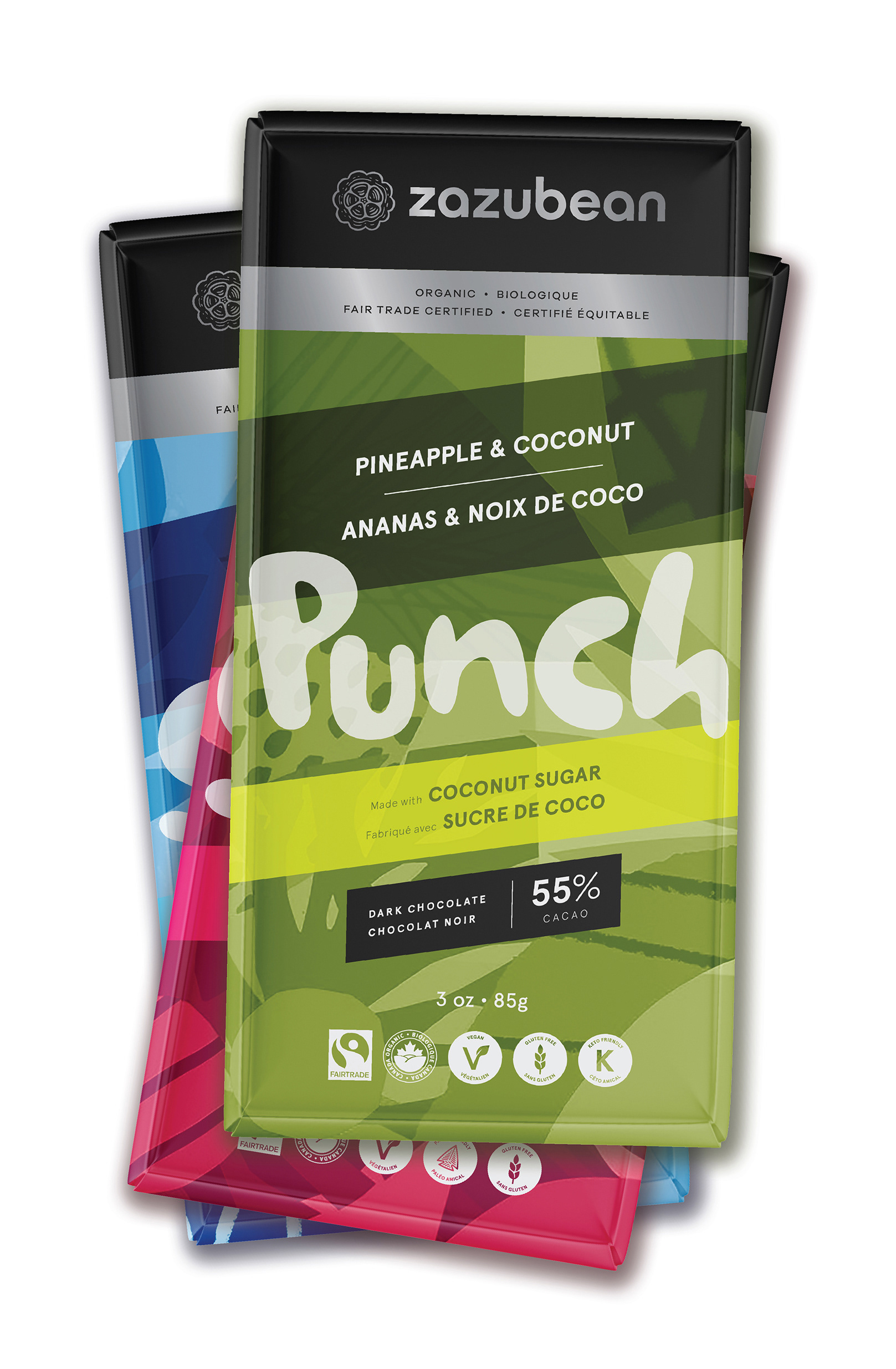
Years of iterative changes for Zazubean chocolate's packaging resulted in a confusing hierarchy, underperforming shelf-presence, and a dated design that was being overtaken by competitors. This work sought to evolve a redesign rather than start from scratch, and maintain the dynamic, quirky and bold approach of the brand.
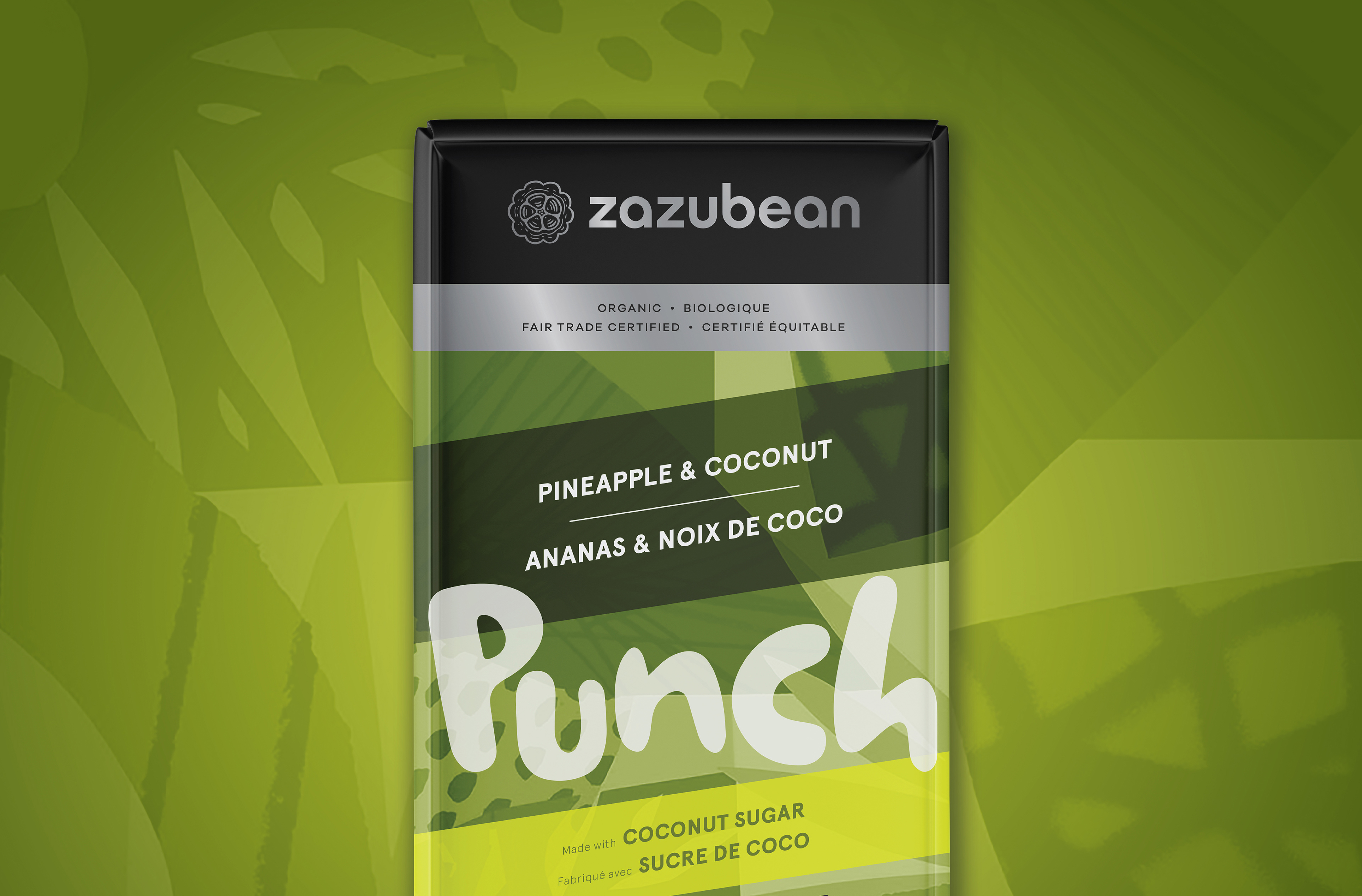
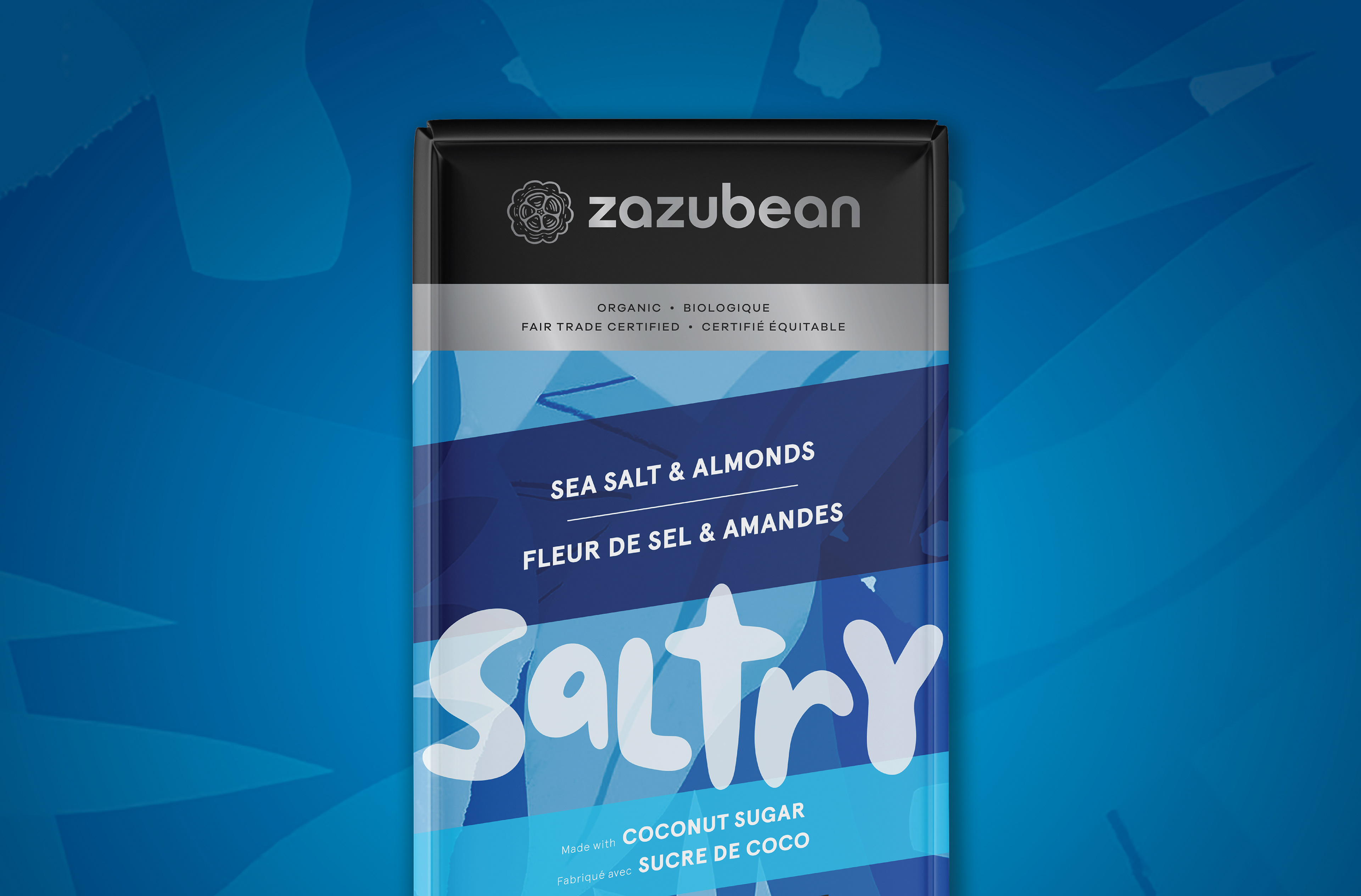
Expressive illustrations form the basis of the renewed energy, while the swooshes and curves are replaced by simpler angles. Quirkiness is maintained while increasing sophistication; the package has a more premium feel to reflect the price point, but hasn't lost the element of fun. Importantly, the brand itself gets more prominence as part of a completely overhauled on-pack hierarchy.
(This work is a client-rejected concept.)

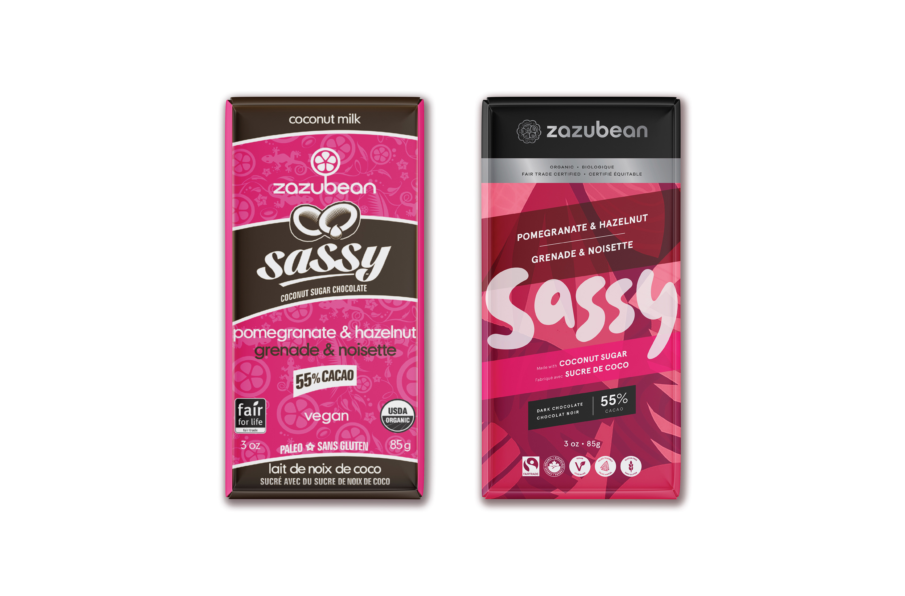
Before & after
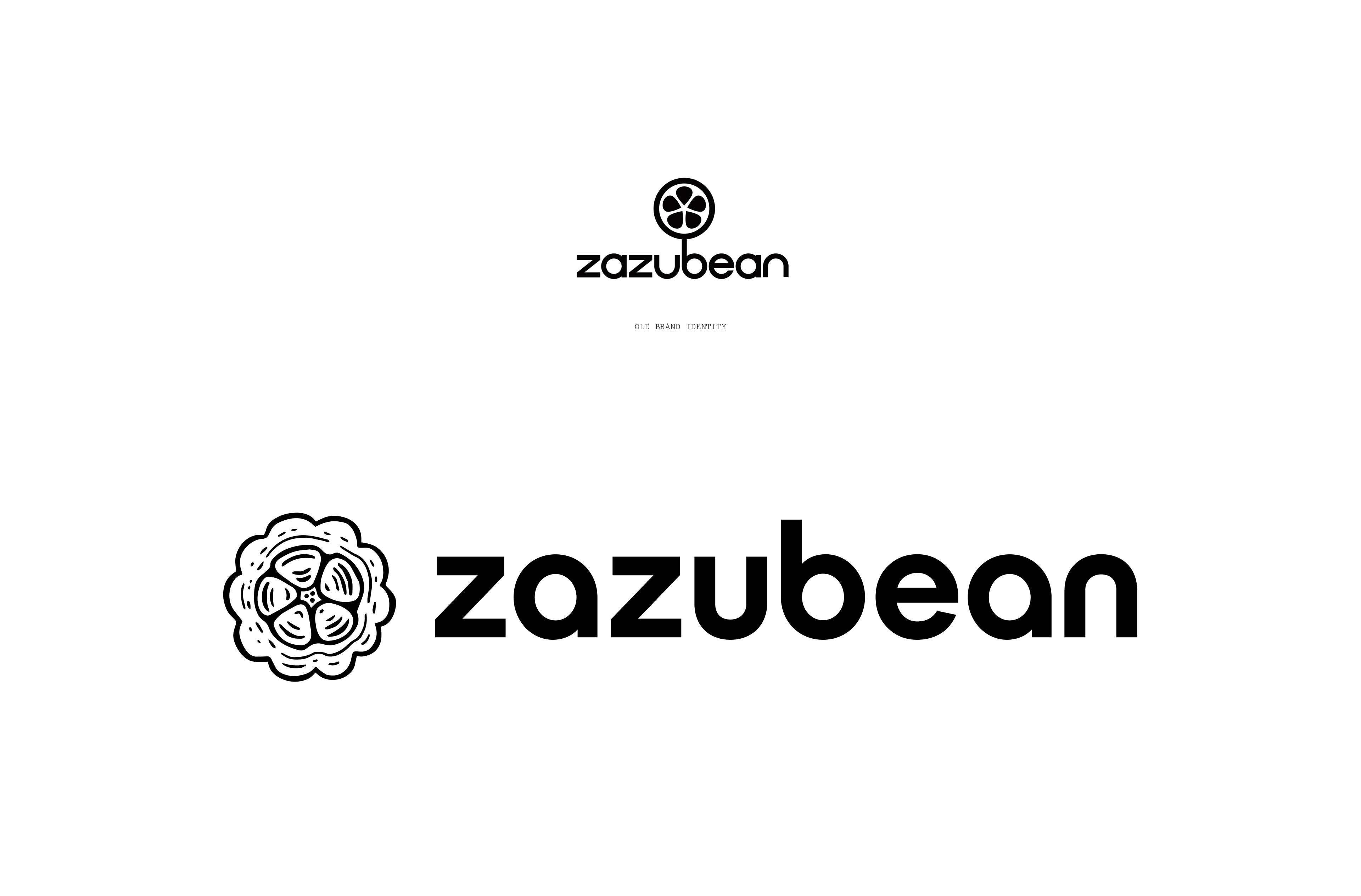
Brand identity evolution